Brief
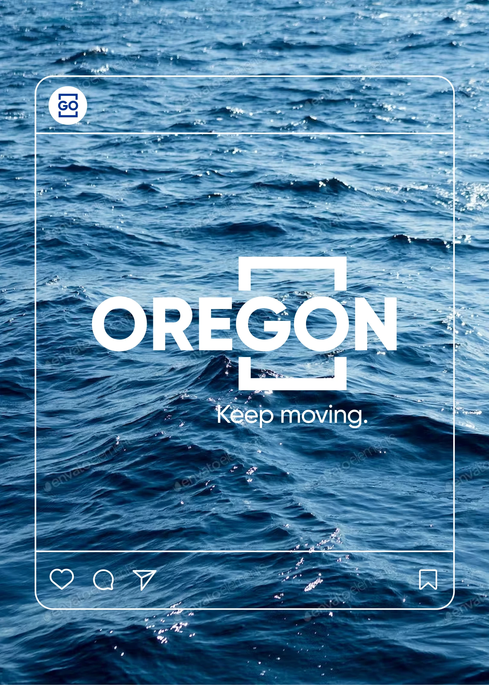
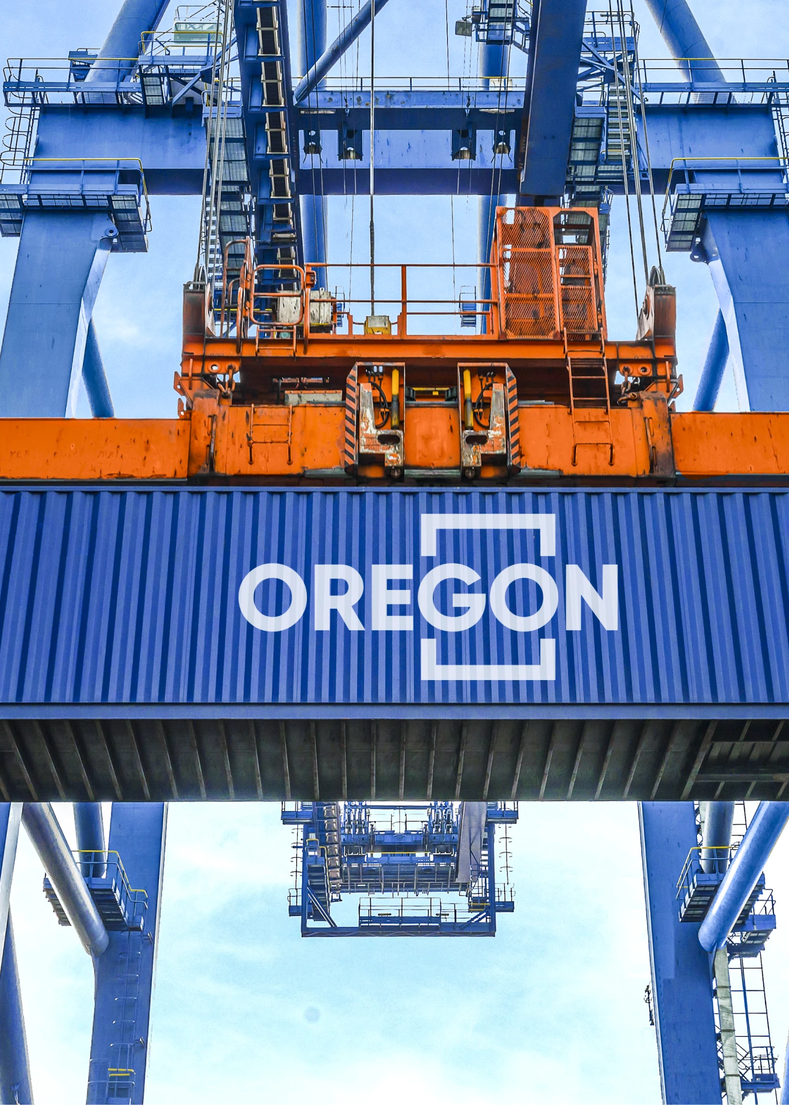
They requested us to emphasize the fact that they provide transit services to their customers, enabling them to move seamlessly through customs and other barriers.
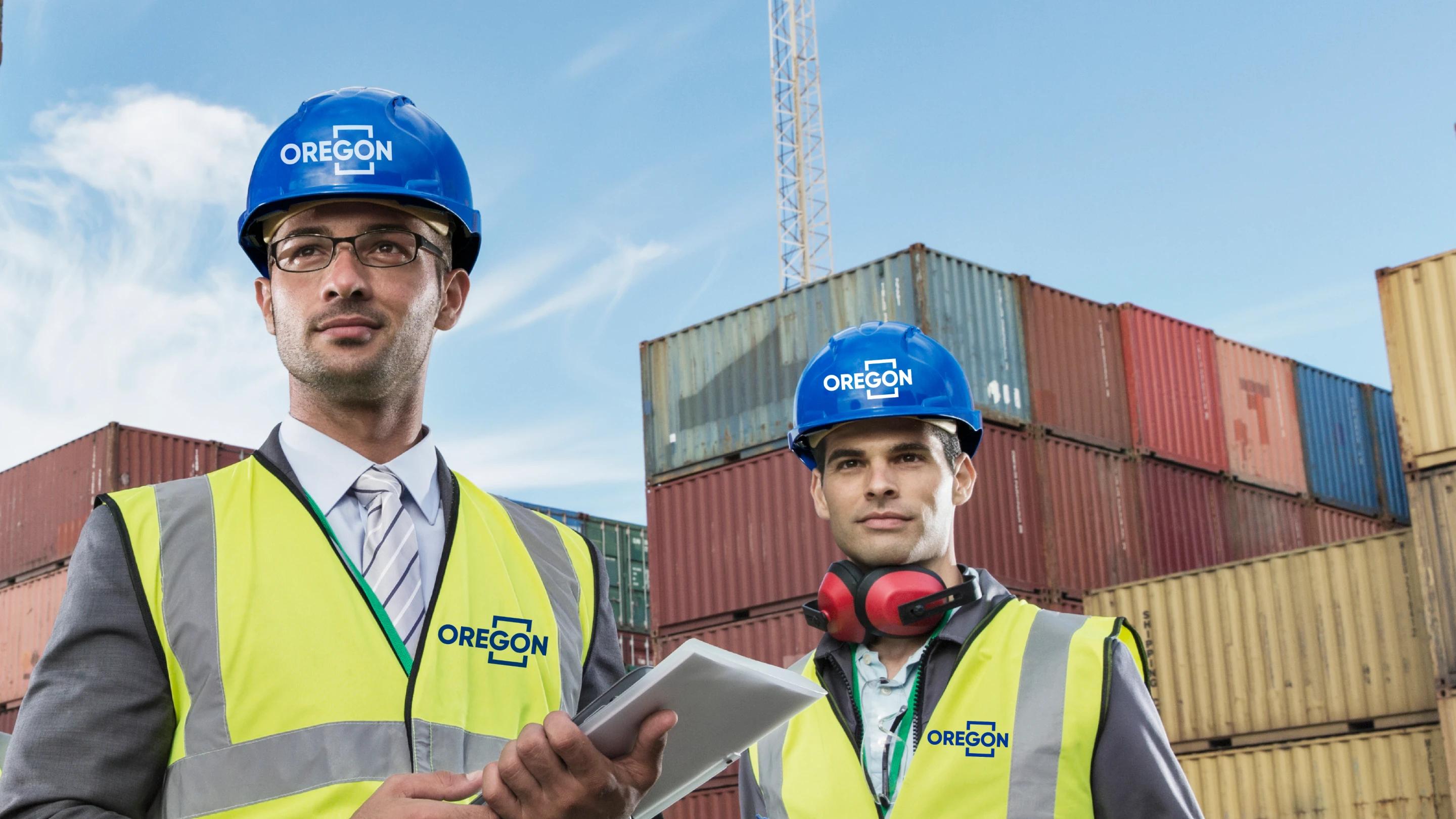
They expressed their desire to make this update by revising their existing logos rather than completely changing them.
They mentioned that their current logos are weak and have issues with legibility and application on different backgrounds. They also highlighted that they have been unable to use them effectively in digital channels.

Methods
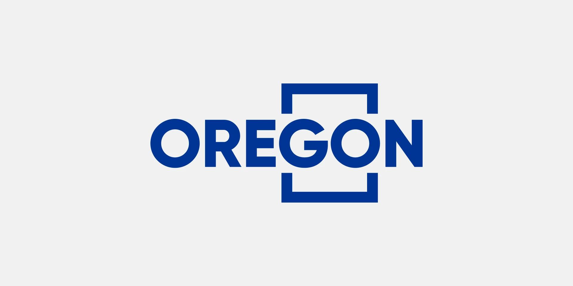
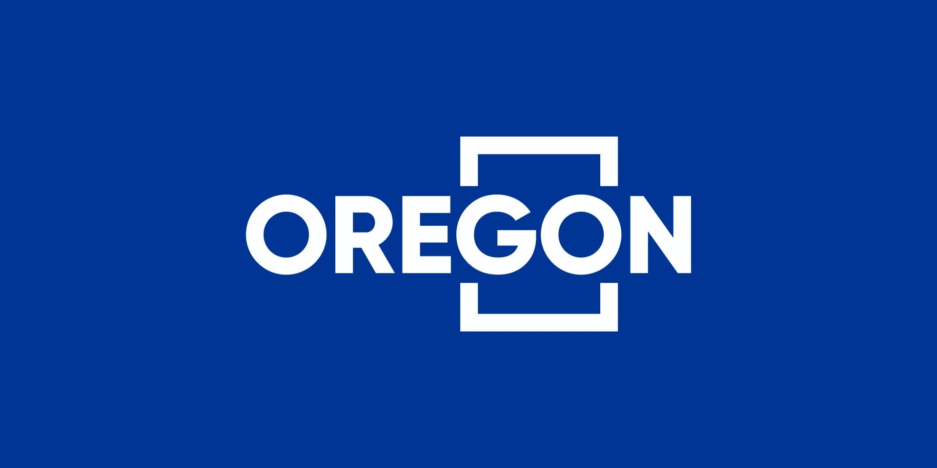
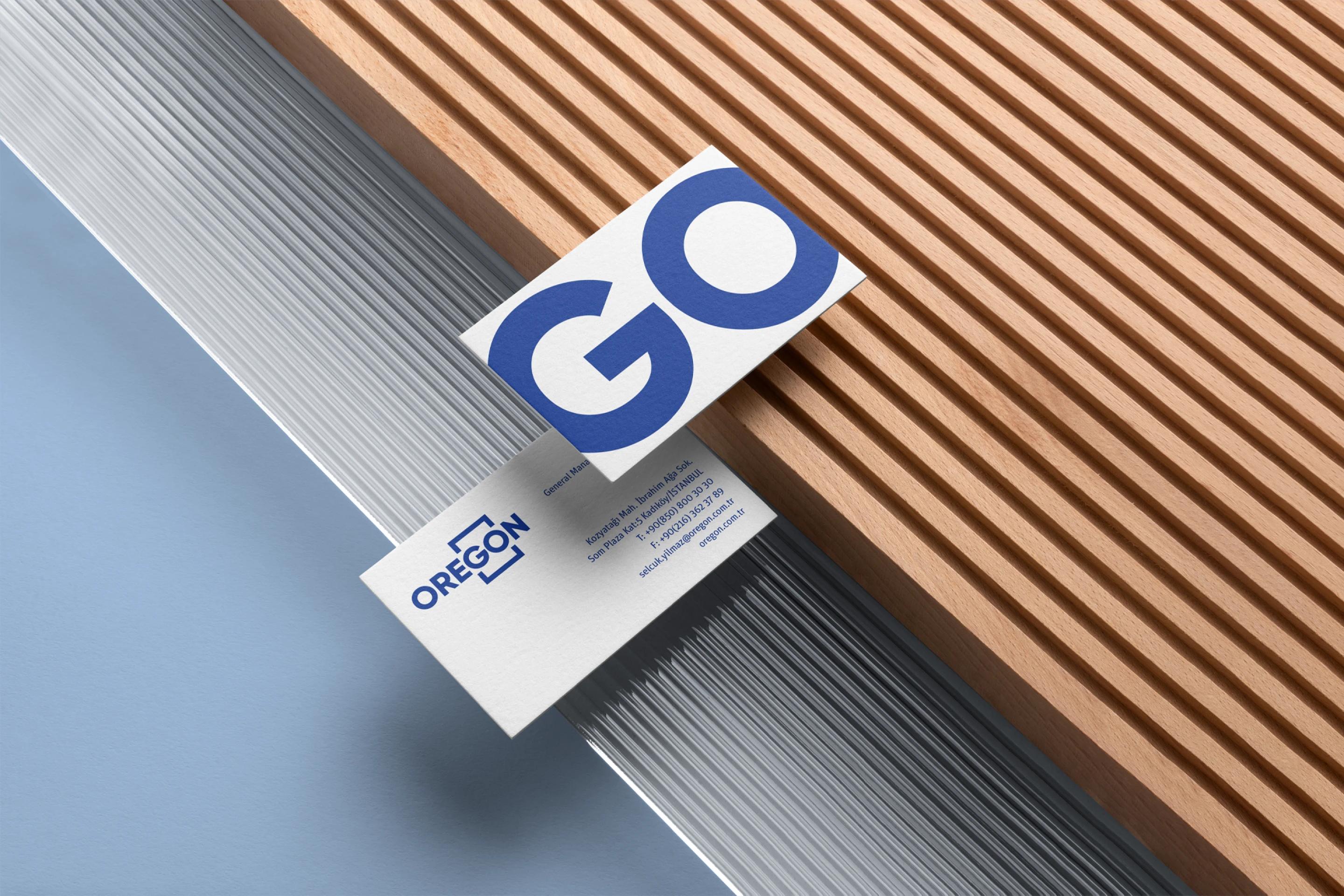
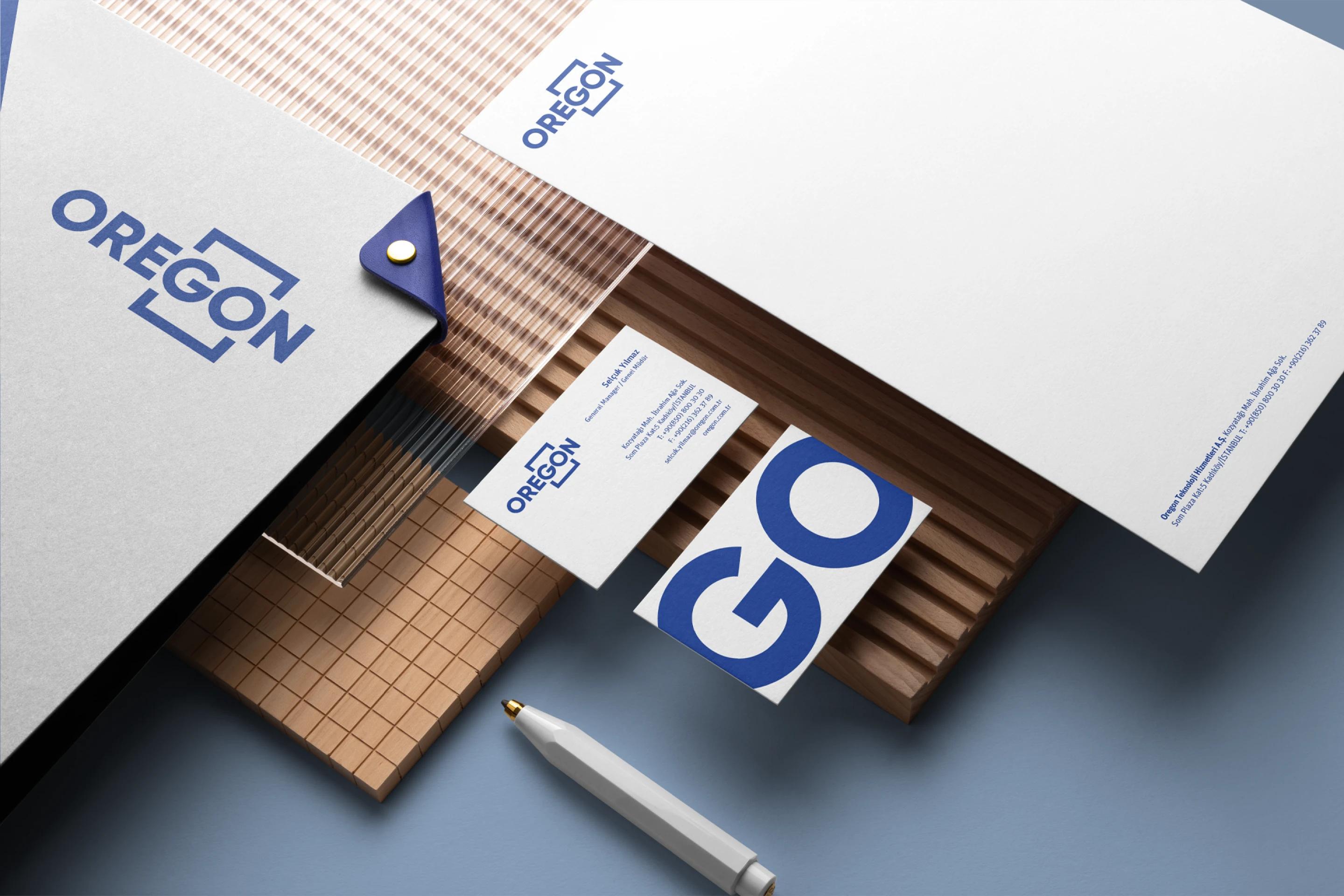
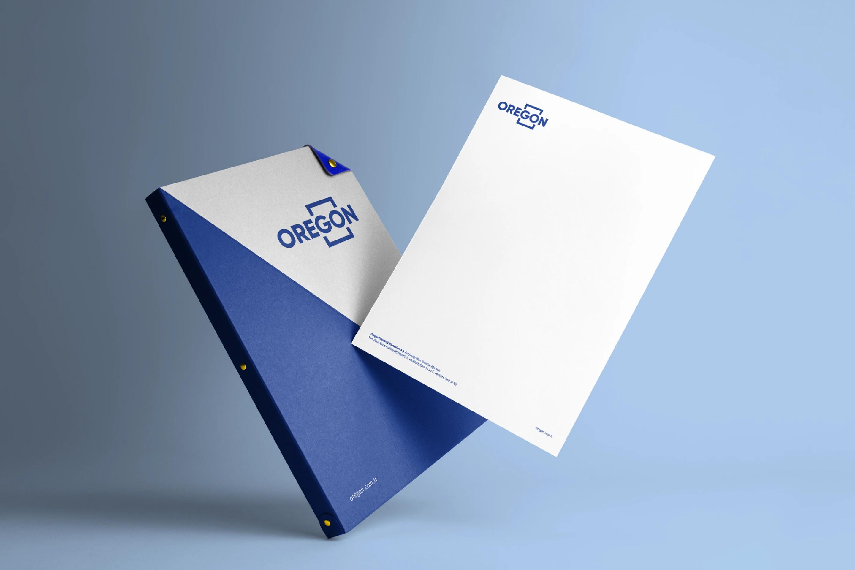
To emphasize the uninterrupted service, we strengthened the container line surrounding the "GO" element.
We supported the concept of uninterrupted end-to-end service by incorporating the slogan "Keep moving."
We revised their existing logos using a minimalist approach with clean and simple lines.
We achieved a strong and readable logo design by using only typography.
In addition to simplicity and modernity, we created an attention-grabbing logo design using geometric shapes.
We designed icon sets that align with the logo style.
Results
With the symbols and colors used, a logo was designed in accordance with the target audience and today's trends, referring to the metaverse and pleasant time.

""IIffyyoouu''rreellooookkiinnggffoorraaffiirrsstt--ccllaassssaaggeennccyy,,llooookknnooffuurrtthheerrtthhaannCCoolloonniicc..TThheeiirrtteeaammssaarreeppaassssiioonnaattee,,ttaalleenntteedd,,aannddddeeddiiccaatteeddttooddeelliivveerriinnggeexxcceeppttiioonnaallrreessuullttss..WWhheenniittccoommeessttooqquuaalliittyy,,CCoolloonniicciisstthheennaammeetthhaattccoommeessttoommiinndd..""