Brief
They mentioned that they want to change their logos because they don't reflect the company's values, industry, and target audience.
They requested that the graphical elements in the logos should represent that they are a logistics software company.
They also emphasized their expectation for the logos to accurately represent the company in digital platforms.
Methods
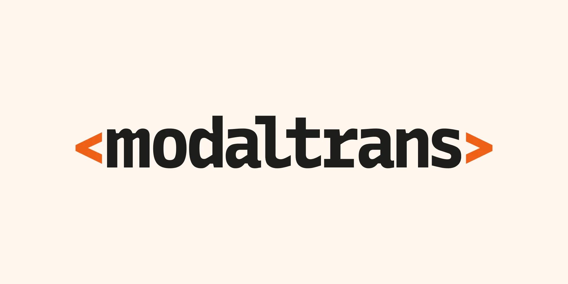
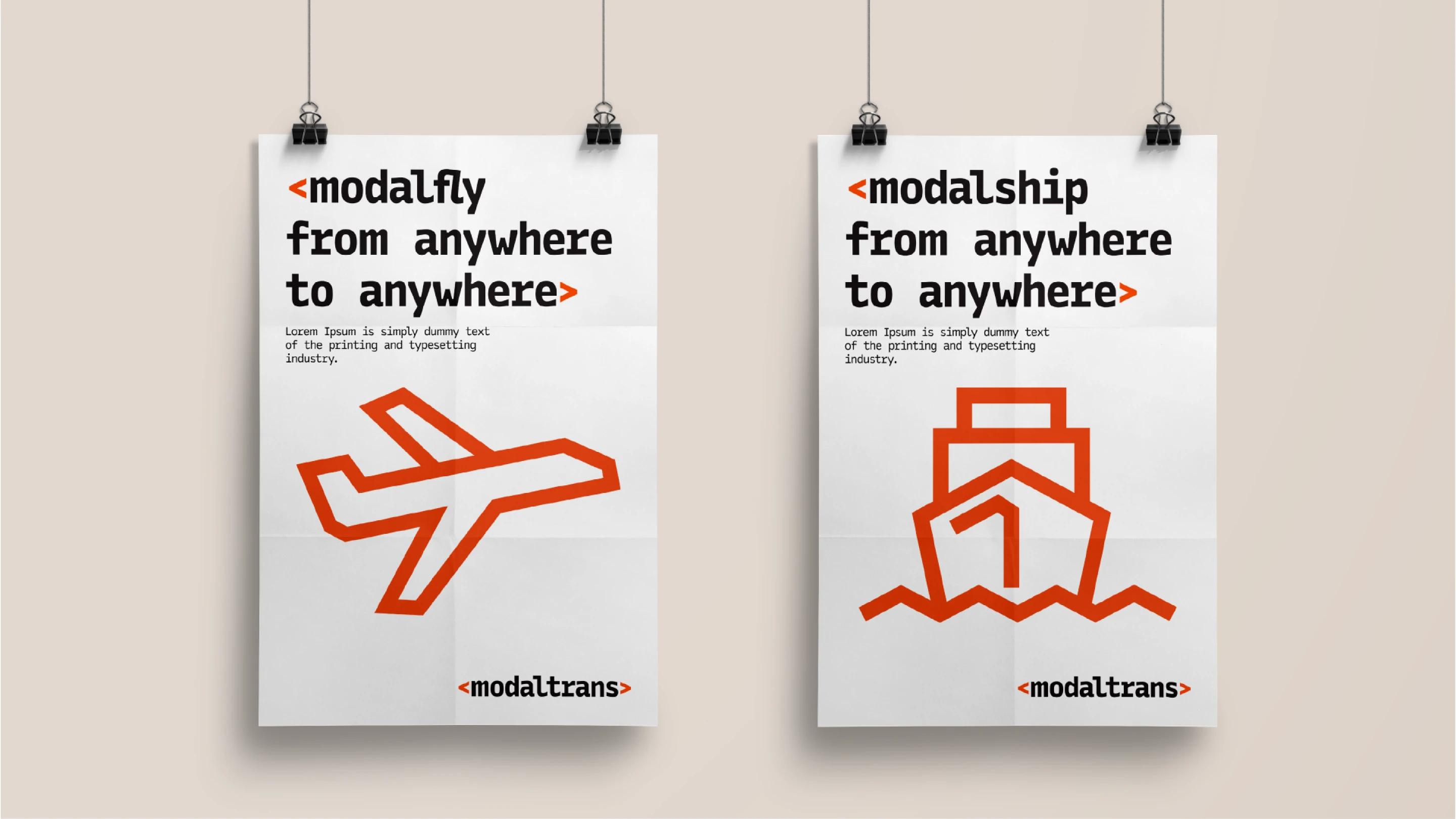
We used power symbols as icons, considering the simplicity since we are a software company.
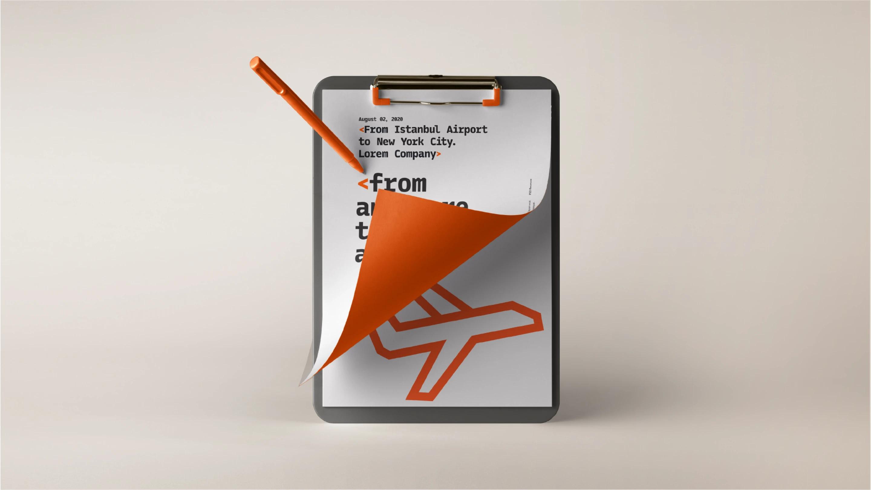
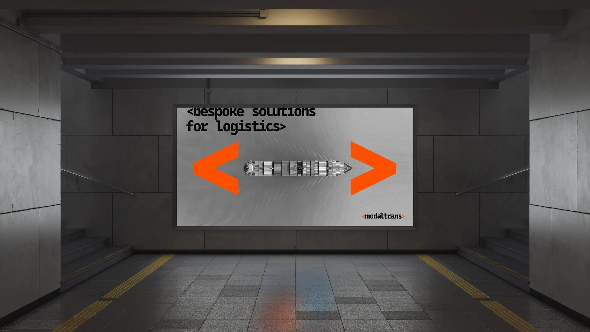
Similarly, these arrows represent moving from one place to another.
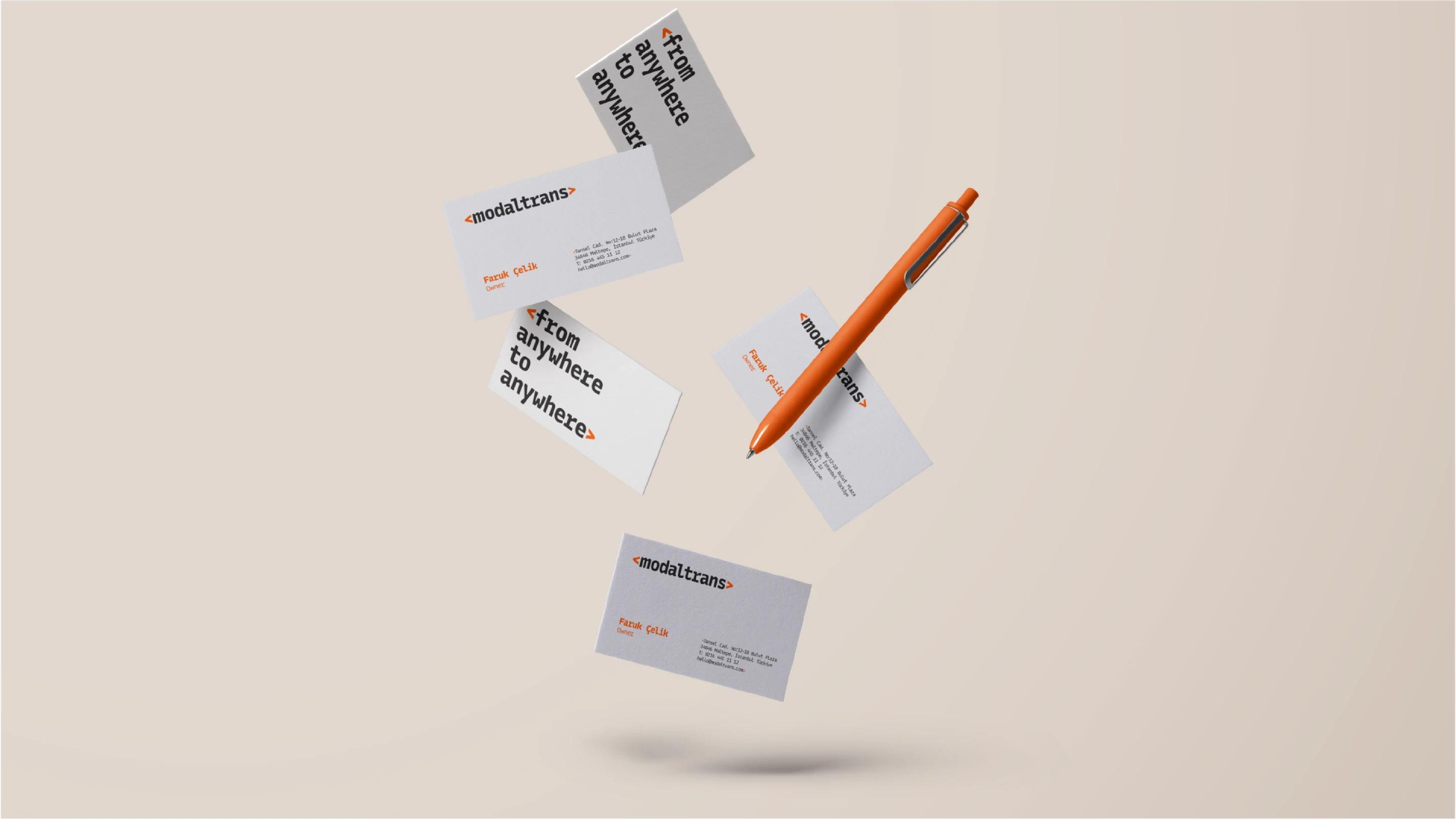
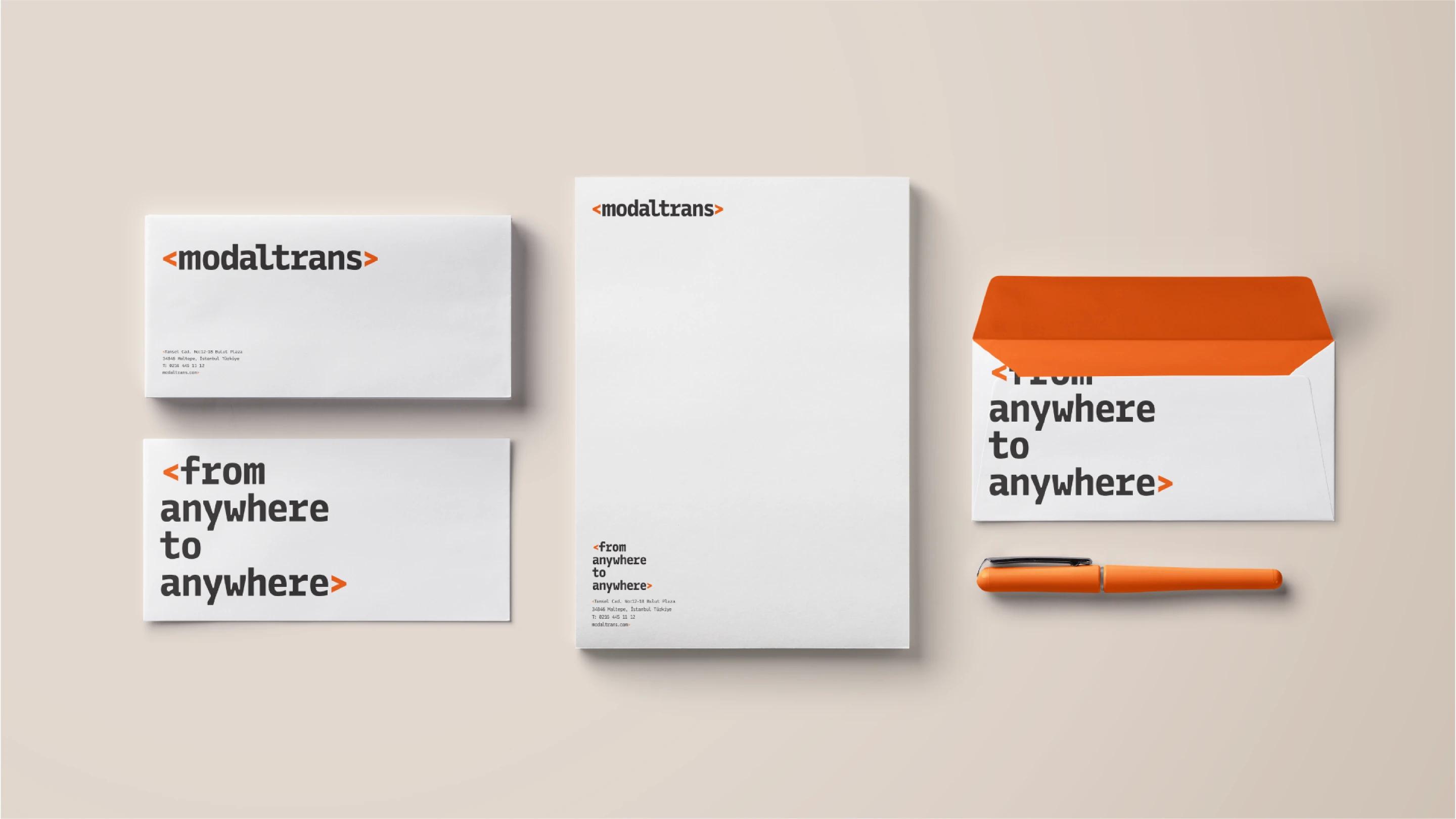
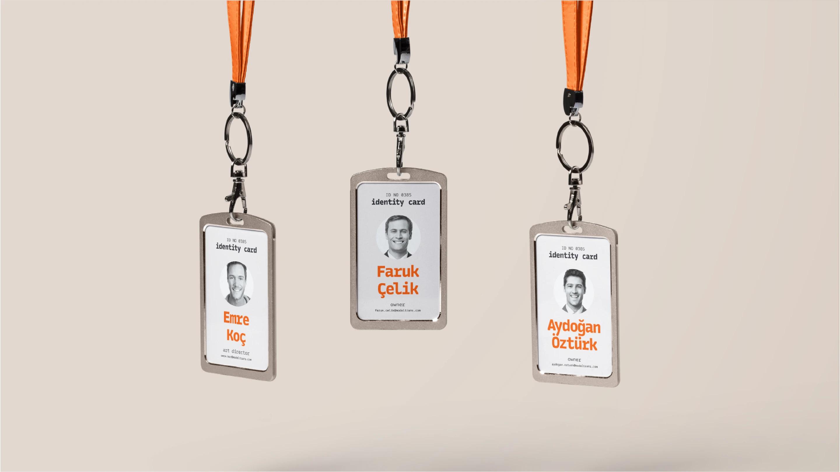
We designed the logo with a minimalist approach, using clean and simple lines.
By using only typography, we achieved a strong and legible logo design.
For the color, we used orange to represent speed and power.
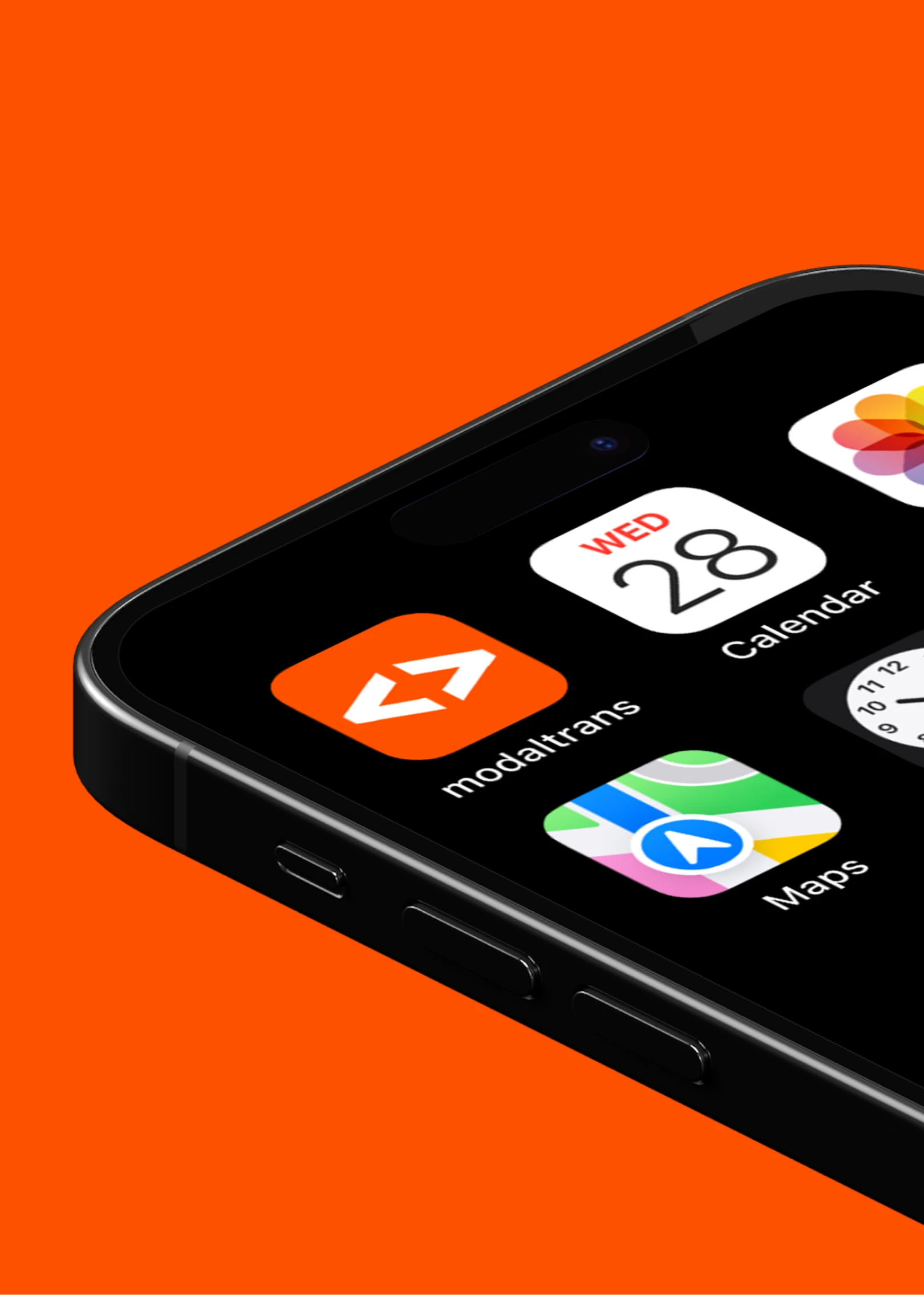
We also created icon sets that are in line with the logo style.
Results
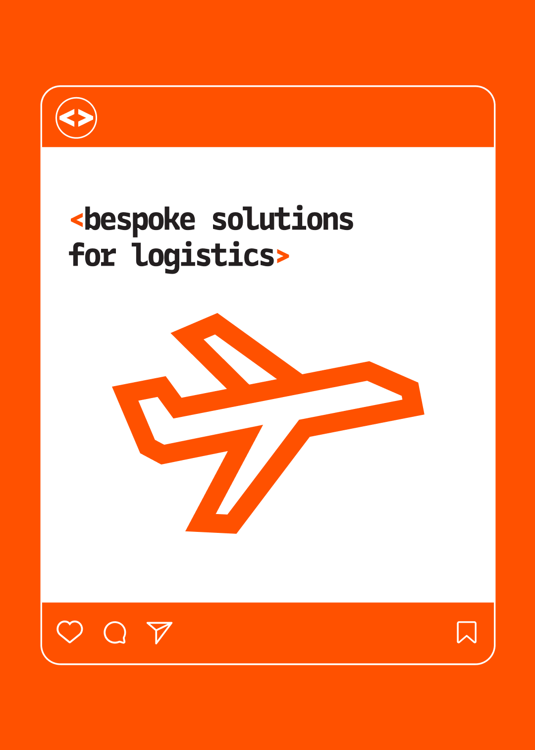
A simple and powerful logo was designed that reflects the brand as a logistics software company at first glance and embodies the brand's values, mission, and goals.

""WWoorrkkiinnggwwiitthhCCoolloonniiccwwaassaaffaannttaassttiicceexxppeerriieennccee..TThheeiirrtteeaammwwaasspprrooffeessssiioonnaall,,ttaalleenntteedd,,aannddaallwwaayysswweennttaabboovveeaannddbbeeyyoonnddttoommeeeettoouurrnneeeeddss..HHiigghhllyyrreeccoommmmeenndd!!""